

Key Highlights:
- A complete leadership-focused guide to modern data visualization techniques that improve KPI clarity, strategic decision-making, and real-time business performance in 2025.
- Explains which visualization techniques align with specific business goals, helping CEOs, CMOs, CFOs, and analytics leaders convert complex data into actionable insights.
- Industry-specific examples and real-world use cases showing how top companies leverage advanced visualization for forecasting, retention, margin analysis, and competitive intelligence.
Introduction
Data is now the backbone of every business, but leaders don’t just need more data – they need clarity. Clear insights. Actionable patterns. Decisions that move the company forward. This is exactly where the right Data Visualization Techniques make all the difference.
In 2025, visualization has evolved far beyond static charts or dashboards. Modern techniques help leaders interpret KPIs faster, communicate insights more effectively, and make confident decisions backed by real-time analytics. Whether you’re a CEO, CMO, CFO, or Head of Analytics, understanding which visualization techniques matter – and when to use them – is a strategic advantage.
This guide highlights the most important techniques, the best use-cases, and how business leaders can leverage them for smarter decisions, ROI improvements, and competitive advantage.
Why Data Visualization Matters for Business Leaders in 2025?
Data visualization is no longer just an analyst’s job. Leaders now interact with dashboards daily – for board meetings, performance reviews, forecasting, or competitive tracking. Using the right Data Visualization for Business Leaders means reducing complexity, improving KPI clarity, and making faster, more informed decisions.
Here’s why visualization is a leadership priority today:
- Businesses deal with more data volume than ever
- Competitive decisions depend on understanding trends quickly
- Data storytelling drives team alignment
- Leaders need better business decision insights
- Real-time data now defines market agility
Well-chosen visualization techniques amplify strategic thinking and remove uncertainty from decision-making.
Modern Data Visualization Techniques for 2025
Data visualization has evolved significantly. Today’s leaders need more than bar charts and pie charts – they need modern data visualization techniques for 2025 that simplify complexity while presenting insights that directly support business goals.

Below are the techniques that offer maximum value in 2025:
1. Interactive Dashboards
Interactive dashboards let leaders click, filter, and drill into KPIs instead of reading static reports. They make it easy to explore performance across stores, products, marketing campaigns, or financial results — helping leadership teams quickly find answers and make confident decisions.
2. Real-Time Data Visualization
Real-time visuals update instantly as new data flows in. They help businesses track live performance, price changes, stock levels, demand fluctuations, or anomalies the moment they happen — enabling faster responses to market shifts or operational risks.
3. Heatmaps & Geo-Maps
Heatmaps and geo-maps show performance across locations using colors and geographic points. Leaders can instantly see high-performing areas, underperforming regions, delivery bottlenecks, or new market opportunities on a map.
4. Sankey Diagrams
Sankey diagrams show how customers, resources, or processes move from one step to another. They make it easy to understand customer journeys, spot where drop-offs occur, and identify inefficiencies in multi-step workflows.
5. Waterfall Charts
Waterfall charts break down how revenue, cost, or profit changes from one stage to the next. They help CFOs and decision-makers see exactly which factors contribute to growth, which drain margins, and how financial variance builds over time.
6. Radar & Spider Charts
Radar charts compare multiple performance metrics at once. They help leaders benchmark teams, products, departments, or regions side-by-side — clearly showing strengths, weaknesses, and areas needing improvement.
7. Small Multiples
Small multiples display the same chart repeated across different categories. This helps leaders compare trends across products, stores, regions, or customer segments — spotting patterns and differences without cluttering the dashboard.
Transform Your Business Insights With Modern Visualization—Connect With X-Byte Analytics Today.
Best Data Visualization Techniques for Decision Making
The biggest gap in competitor content is that they list visualizations but don’t explain which technique supports which business decision. Leaders need precise alignment between KPI and techniques.
Below are the best data visualization techniques for decision-making:
1. KPI Visualization Using Bullet Charts
Best for target vs. actual performance tracking across departments. Bullet charts offer a clean and compact way for leaders to quickly see how KPIs measure up against goals, helping them identify progress and spot underperformance instantly.
2. Trend Forecasting with Line & Area Charts
Useful for revenue forecasting, demand prediction, and performance tracking. These charts help leaders easily spot patterns, seasonality, or sudden shifts over time, making strategic planning and budgeting much more accurate.
3. Cohort Analysis Charts
Help leaders understand user retention, repeat behavior, order cycles, and loyalty. By grouping customers and tracking how each cohort behaves over time, leaders uncover which segments drive long-term value and where churn or drop-offs occur.
4. Margin Analysis with Waterfall Charts
Provides clarity on cost components, revenue drivers, and bottom-line impact. Waterfall charts break down how each factor adds or subtracts from profit, helping leadership identify leakages, inefficiencies, and opportunities to improve margins.
5. Competitor Tracking with Heatmaps
Retailers and ecommerce brands use this to compare competitor prices, stock levels, and promotions. Heatmaps visually highlight differences in pricing and availability, enabling leaders to react quickly with smarter pricing or promotional strategies.
These techniques have direct impact on leadership decision-making and help remove guesswork.
Industry-Specific Data Visualization Techniques
Different industries operate with different data types, customer journeys, and reporting needs. That’s why industry-tailored visualization techniques deliver far clearer insights than generic dashboards. Adding the right visuals ensures leaders get faster decisions, better accuracy, and more relevant stories behind their data.
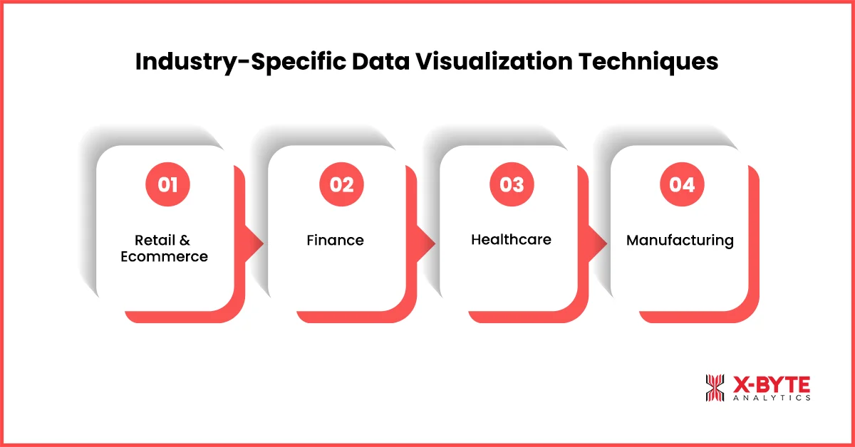
Here are the top Industry-Specific Data Visualization Techniques:
Retail & Ecommerce
Retail and ecommerce brands handle massive volumes of product, pricing, and customer journey data. Visualizations in this industry focus on understanding buying patterns, optimizing store or website performance, and improving pricing and merchandising decisions.
1. Category-wise heatmaps
Great for spotting high-performing and low-performing product groups. They help retail leaders make better merchandising and inventory decisions.
2. Funnel performance charts
These highlight drop-offs across checkout stages or conversion journeys. Brands use them to improve user flow and reduce abandoned carts.
3. Price change visualizations
Show competitors’ pricing patterns and promotional cycles. They help revenue teams adjust pricing strategies in real time.
4. Store-level geo maps
Visually compare store performance based on geography and demographics. Leaders use this to optimize store expansion and local campaigns.
Finance
The finance industry depends on precise, time-sensitive insights to evaluate markets, manage risks, and track profitability. Visualization techniques here focus on spotting financial patterns quickly, comparing assets, and understanding what drives revenue or cost fluctuations. These visuals help leaders make confident investment and budgeting decisions.
1. Candlestick charts
Perfect for analyzing market trends, trading volumes, and volatility. Financial teams rely on them for fast investment decisions.
2. Risk radar charts
Used to track credit risk, market risk, and operational risk in one view. Leaders can quickly identify exposure areas before they escalate.
3. Variance waterfall charts
Break down revenue, cost, and budget variances with absolute clarity. Finance teams use this to understand what drives profit movement.
4. Market trend comparison charts
Enable comparison of assets, funds, or portfolios side-by-side. This helps leadership assess performance across investment options.
Healthcare
Healthcare organizations rely on precise, real-time insights to manage patient flow, staffing, and critical resources. Visualization techniques in this industry focus on improving hospital efficiency, reducing wait times, and ensuring optimal use of beds, equipment, and medical staff. These visuals support faster clinical and operational decision-making.
1. Patient flow heatmaps
Visualize patient movement from admission to discharge. Hospitals use them to reduce bottlenecks and improve patient experience.
2. Bed occupancy dashboards
Track real-time availability of beds across departments. Leaders use this to manage capacity planning and resource allocation.
3. Procedure volume mini-charts
Offer quick insights into high/low procedure volumes. Healthcare teams rely on these for operational budgeting and staffing.
Manufacturing
Manufacturers operate in environments where efficiency, quality, and uptime directly impact profitability. Visualization techniques in this industry help teams monitor production stability, reduce downtime, and maintain consistent output. These visuals enable leaders to optimize processes, improve forecasting, and strengthen overall operational performance.
1. SPC charts
Show variations in production quality and stability. Manufacturing leaders use them to improve process reliability.
2. Machine downtime dashboards
Track machine interruptions, failure patterns, and maintenance cycles. This helps reduce operational costs and avoid production delays.
3. Production volume trends
Highlight daily, weekly, or monthly output levels. Leaders use them to improve forecasting and supply chain rhythm.
Industry relevance is key to leadership-ready visuals, especially for data visualization in business intelligence applications.
How to Choose the Right Data Visualization Technique
Business leaders need a simple way to understand to choose the right data visualization technique based on the purpose and KPI type. Choosing the right visualization is as important as presenting the right data. A structured selection approach ensures your insights stay clear, unbiased, and decision-ready.
Here’s a simple way to pick the right chart:
1. If you want to compare categories → Use Bar/Column Charts
Perfect for sales comparisons, department performance, or product ranking. These charts display differences clearly without overwhelming the visual layout.
2. If you want to track trends over time → Use Line/Area Charts
Great for revenue, traffic, cost, and operational patterns. Leaders use them to identify long-term health and performance cycles.
3. If you want to analyze distribution → Use Histograms & Box Plots
Useful for customer segmentation, delivery timings, and price bands. They reveal hidden patterns and variability within data groups.
4. If you want to understand relationships → Use Scatter/Bubble Charts
Ideal for CAC vs LTV, price vs demand, or performance vs spend. They help leaders validate correlations before making strategic decisions.
5. If you want to understand processes → Use Sankey Diagrams
Shows how users move through journeys or how resources flow across functions. They are essential for identifying inefficiencies in multi-step processes.
6. If you want executive dashboards → Use Bullet, KPI Tiles & Summary Cards
These simplify complex performance into single-glance insights. They are widely used by CXOs for quick decision-making in board meetings.
For a deeper understanding of how to structure your visuals effectively, explore our complete data visualisation guide.
Data Visualization Techniques for Enterprise Analytics
Large-scale organizations deal with millions of data points across multiple systems. Effective data visualization techniques for enterprise analytics must support scale, speed, and clarity.
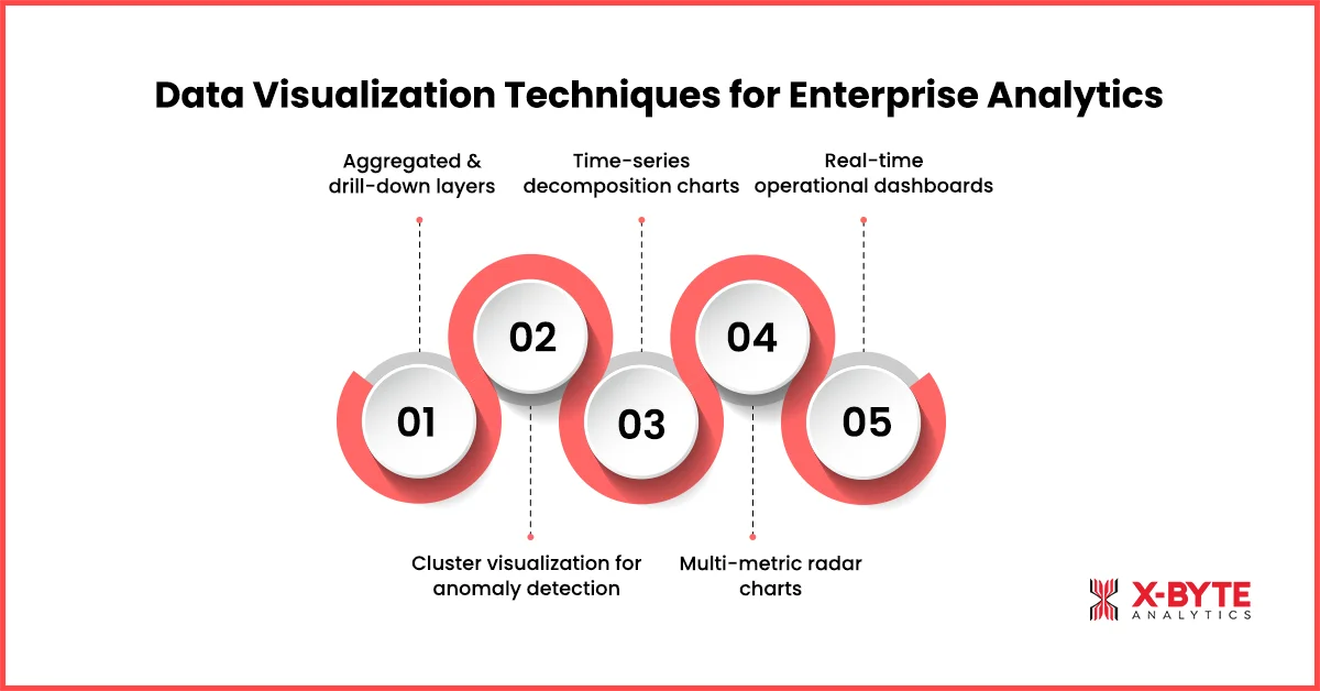
The right techniques should not only highlight what’s happening but also reveal why it’s happening and what actions should follow. These visuals help executives move from high-level summaries to detailed insights, detect anomalies early, compare performance across units, and monitor operations in real time. Here are the most effective visualization approaches leaders rely on today:
1. Aggregated and drill-down layers
They allow executives to explore summaries and then dig deeper into details. This layered approach keeps dashboards clean yet powerful.
2. Cluster visualization for anomaly detection
Useful for spotting outliers in huge datasets. Leaders use this to detect unusual patterns before they turn into risks.
3. Time-series decomposition charts
Break down trends into seasonality, patterns, and noise. These charts support more accurate forecasting and predictive decisions.
4. Multi-metric radar charts
Display different KPIs on a single compact visual. They help compare regions, departments, or product lines in one view.
5. Real-time operational dashboards
Essential for logistics, retail, finance, and manufacturing. These dashboards alert teams instantly when performance diverges from expectations.
These techniques help enterprises quickly identify outliers, performance gaps, demand patterns, or efficiency issues.
Data Visualization Best Practices for Clear Leadership Insights
Before applying any visualization technique, leaders must ensure their dashboards follow strong Data Visualization Best Practices – both in design and data storytelling.
Here are the most important principles:
1. Keep visualizations simple and focused
Avoid clutter and unnecessary design elements. Simple charts improve comprehension and reduce cognitive load.
2. Use consistent metrics and visual styles
Leadership dashboards should follow unified logic across teams. Consistency improves trust and decision accuracy.
3. Choose colors intelligently
Avoid confusing color scales that distort meaning. Smart color choices highlight what matters without distraction.
4. Bring data storytelling forward
Use captions, highlights, and contextual notes. This transforms raw charts into narratives leaders can act on.
5. Prioritize KPI Visualization
Place mission-critical KPIs at the top of dashboards. This ensures teams focus on what drives performance most.
Real-World Examples: How Top Companies Use Visualization Techniques?
Data visualization isn’t just about charts—it’s a business advantage. Global enterprises rely on visual analytics to uncover hidden patterns, make faster decisions, and align teams around real-time insights. Whether it’s pricing, customer behavior, or operational performance, the right visualizations turn complex data into actionable intelligence. Here’s how leading companies use visualization to drive measurable business impact:
Example 1: Amazon – Using Real-Time Dashboards to Optimize Pricing & Inventory
Amazon uses real-time data visualization dashboards to monitor pricing, inventory, demand spikes, and competitor movements across millions of SKUs.
By combining interactive dashboards and real-time visualizations, Amazon’s teams can instantly react to price changes, adjust Buy Box strategy, and prevent stockouts.
Impact: Faster price adjustments, optimized inventory flow, and significantly higher Buy Box win-rates across categories.
Example 2: Netflix – Using Cohort & Behavioral Visualizations to Boost Retention
Netflix famously uses cohort analysis charts and viewer journey flow visualizations to understand how users engage with content over time.
These visuals help them identify which shows improve retention, where drop-offs happen, and how user segments behave across the platform.
Impact: Smarter content investment, improved personalization, and higher user retention – directly influencing revenue growth.
These examples highlight how the right visualization techniques drive measurable business value.
Unlock Powerful Decision-Making With Expert Data Visualization Consulting From X-Byte Analytics.
Conclusion
In 2025, business leaders need to go beyond traditional charts and embrace the full potential of modern Data Visualization Techniques. The right techniques turn raw data into clarity. They help leaders understand KPIs at a glance, make faster decisions, improve forecasting accuracy, spot opportunities earlier, and run more aligned and efficient teams.
Whether you’re leading a retail chain, financial organization, healthcare institution, or global enterprise, mastering data visualization is no longer optional – it’s a competitive advantage.
With the right techniques, frameworks, and best practices, data transforms from “information” into strategic power.


