Key Highlights
- A business-focused overview of data visualization consulting, covering dashboards, KPIs, BI reporting systems, and data storytelling best practices for decision-ready analytics.
- Clear insights into dashboard types, visualization methods, and chart selection frameworks to build scalable, user-centric BI dashboards.
- Practical use cases showing how Power BI, Tableau, and modern BI platforms unlock insights, improve decision-making, and deliver measurable ROI.
In today’s data-driven economy, data visualization consulting has become a mission-critical capability for organizations that want to compete, scale, and make faster decisions. Businesses generate massive volumes of data every day, but without the right business intelligence dashboards, visualization frameworks, and BI reporting systems, that data remains underutilized.
Modern enterprises need more than static charts or spreadsheet reports. They need interactive dashboards, real-time analytics, and KPI-driven visuals that turn complex datasets into clear, actionable insights. This is where professional data visualization services play a decisive role, bridging the gap between raw data and executive-level decision-making.
This guide is a comprehensive resource for organizations evaluating or investing in data visualization services, dashboard development, and BI reporting solutions. It explains how data visualization consulting works, why it directly impacts business performance, and how scalable BI systems are built using platforms like Power BI, Tableau, and modern analytics ecosystems.
You’ll gain clarity on visualization best practices, dashboard types, common challenges, and industry-specific use cases, while learning how businesses can design analytics environments that support growth, improve operational visibility, and drive measurable ROI. Whether you are modernizing your BI strategy or looking for expert guidance, this guide is designed to help you make informed, confident decisions.
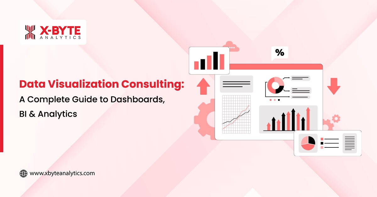
What Is Data Visualization Consulting?
Data visualization consulting is a specialized analytics service that helps organizations transform complex, fragmented, and high-volume data into clear, actionable insights that drive better decisions. While many companies produce reports and dashboards, visualization consulting ensures data is accurate, structured, and aligned with real business objectives, not just displayed.
At its core, data visualization consulting connects business context with analytics execution. By combining data modeling, KPI design, visualization best practices, and BI expertise, it bridges the gap between raw data and decision-making. The result is dashboards that clearly explain what is happening, why it matters, and what actions should be taken next.
Unlike static or one-off reports, professional data visualization consulting services focus on scalability and usability. Organizations move beyond spreadsheets and disconnected dashboards toward interactive BI dashboards, real-time analytics, and structured data storytelling that support confident, data-driven decisions across teams.
Key Benefits of Data Visualization Consulting in BI
Data visualization consulting delivers measurable value by aligning analytics with business outcomes, not just visuals. Key benefits include:
- Clear business alignment by defining objectives, KPIs, and success metrics that directly support decision-making
- User-centric dashboard design tailored for executives, managers, and analysts with different data needs
- Accurate chart selection and visualization techniques that reduce misinterpretation and cognitive overload
- Interactive BI dashboards built using platforms such as Power BI and Tableau
- Effective data storytelling that helps stakeholders quickly interpret insights and take action
- Scalable and governed BI environments with consistent metrics, performance optimization, and data trust
By improving data clarity, adoption, and consistency, data visualization consulting reduces reporting friction, accelerates decision cycles, and helps organizations unlock the full business value of their analytics investments.
Why Data Visualization Matters in BI & Decision-Making
In modern business intelligence environments, data visualization is the bridge between data and decisions. Organizations work with complex, high-volume datasets, but without clear visual context, insights remain hidden. Effective data visualization transforms raw analytics into intuitive, decision-ready insights that business users can quickly understand and act on.
By reducing cognitive load, highlighting trends and outliers, and making data accessible to both technical and non-technical stakeholders, visualization plays a direct role in improving decision speed, alignment, and business outcomes. This is why data visualization consulting has become a core component of successful BI strategies.
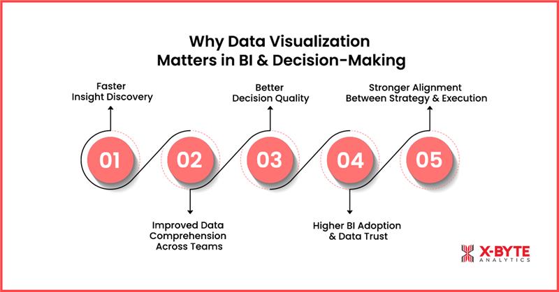
1. Faster Insight Discovery
Well-designed dashboards surface trends, anomalies, and performance gaps instantly. Instead of manually analyzing spreadsheets or static reports, teams can identify issues and opportunities in real time. This accelerates the insight-to-action cycle and enables faster, more proactive decision-making.
2. Improved Data Comprehension Across Teams
Data visualization simplifies complex datasets into clear visuals that are easy to interpret and communicate. Executives, managers, and analysts can quickly grasp key insights without deep technical knowledge, improving understanding and collaboration across departments.
3. Better Decision Quality
Clear visual context supports accurate comparison, forecasting, and risk evaluation. When insights are presented visually, decision-makers gain confidence in the data, leading to more informed, consistent, and data-driven decisions rather than intuition-based judgments.
4. Higher BI Adoption and Data Trust
User-friendly dashboards increase engagement with BI tools. When stakeholders trust the accuracy and clarity of visual insights, BI adoption rises across the organization. This reduces reliance on manual reporting and fragmented data sources.
5. Stronger Alignment Between Strategy and Execution
Visualizing KPIs, targets, and outcomes ensures teams stay aligned with organizational goals. Data visualization helps connect high-level strategy with day-to-day operations, making performance measurable and progress transparent.hts. It integrates with ETL/ELT processes, semantic layers, and data engineering workflows.
Why It Matters for Business Outcomes
The importance of data visualization goes far beyond aesthetics. It is a foundational enabler of effective BI, analytics adoption, and smarter decision-making. Organizations that invest in strong visualization practices gain clearer insights, faster execution, higher BI adoption, and measurable business impact, turning data into a true competitive advantage.
The Full Lifecycle: From Data to Dashboard
Effective dashboards are built through a structured, end-to-end data visualization lifecycle, not just visual design. This lifecycle ensures accuracy, scalability, and adoption while reducing common BI risks such as inconsistent KPIs, low trust, and poor usability.
Key Stages in the Data-to-Dashboard Lifecycle
- Data Pipeline & Preparation (ETL / ELT): Cleans, transforms, and integrates data from multiple sources to create a reliable single source of truth.
- Data Modeling & Semantic Layer: Standardizes KPI definitions, metrics, and relationships to ensure consistency across all dashboards.
- KPI Definition & Metric Alignment: Aligns business goals with measurable KPIs so dashboards support real decision-making, not just reporting.
- Dashboard & Visualization Design: Applies data visualization best practices, right charts, intuitive layouts, interactivity, and storytelling, to convert data into actionable insights.
- Deployment, Governance & Adoption: Ensures performance, security, version control, and user adoption through governance, training, and continuous optimization.
Why This Lifecycle Matters
- Eliminates conflicting metrics and data inconsistencies
- Improves dashboard adoption and stakeholder trust
- Accelerates insight-to-decision cycles
- Maximizes ROI from BI and analytics investments
A well-defined data-to-dashboard lifecycle transforms dashboards from static reports into decision-ready BI assets that drive measurable business impact.
Types of Data Visualization Dashboards & When to Use Them
Different business roles require different levels of visibility, context, and insight depth. Choosing the right dashboard type is critical to ensuring stakeholders see only what matters for their decisions, without unnecessary complexity, noise, or data overload. When dashboards are aligned with specific roles and business goals, organizations achieve higher BI adoption, faster decisions, and measurable performance improvement.
Below are the most common data visualization types used in enterprise BI environments and guidance on when each should be applied for maximum impact.
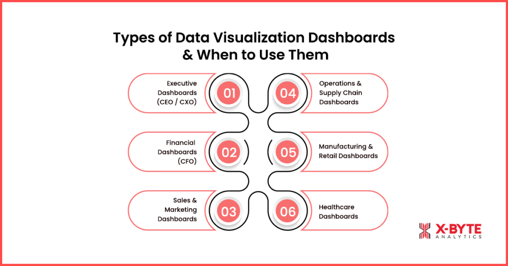
1. Executive Dashboards (CEO / CXO)
Executive dashboards provide a high-level, strategic snapshot of overall business performance. They typically focus on KPIs such as revenue growth, margins, profitability, risk indicators, market performance, and progress against strategic goals.
When to use:
- Board meetings and leadership reviews
- Strategic planning and goal tracking
- Monitoring revenue, profitability, and risk indicators
2. Financial Dashboards (CFO)
Financial dashboards deliver precise, structured views of financial performance, including P&L statements, cash flow, budget vs. actuals, forecasts, variance analysis, and compliance metrics. Accuracy, consistency, and drill-down capabilities are critical at this level.
When to use:
- Budgeting and forecasting cycles
- P&L, cash flow, and variance analysis
- Audits and financial compliance reporting
3. Sales & Marketing Dashboards
Sales and marketing dashboards track funnel performance, lead quality, campaign ROI, CAC, LTV, pipeline value, conversion rates, attribution models, and customer behavior trends across channels.
When to use:
- Funnel and pipeline reviews
- Campaign ROI and conversion analysis
- Revenue forecasting and quota tracking
4. Operations & Supply Chain Dashboards
Operations dashboards focus on efficiency, throughput, inventory levels, cycle times, procurement performance, logistics efficiency, and fulfillment speed. They provide near real-time visibility into operational bottlenecks and cost drivers.
When to use:
- Daily or real-time operational monitoring
- Inventory, logistics, and fulfillment tracking
- Identifying delays, inefficiencies, and cost leakages
5. Manufacturing & Retail Dashboards
Manufacturing dashboards track machine performance, OEE, downtime, production cycles, quality metrics, predictive maintenance signals, and shop-floor KPIs.
Retail dashboards focus on product mix, customer cohorts, category performance, store-level analytics, pricing trends, promotions, and merchandising effectiveness.
When to use:
- Manufacturing: OEE, downtime, predictive maintenance
- Retail: Inventory optimization, pricing, promotions, store performance
6. Healthcare Dashboards
Healthcare dashboards provide visibility into patient outcomes, treatment timelines, clinical quality metrics, resource utilization, wait times, staffing levels, and remote patient monitoring (RPM) data.
When to use:
- Patient outcome and care coordination tracking
- Resource utilization and capacity planning
- Regulatory and clinical performance reporting
Why Dashboard Selection Matters
Choosing the right dashboard type ensures insights are relevant, trusted, and actionable. When dashboards are designed around specific roles and decision needs, whether executive, financial, operational, manufacturing, retail, or healthcare, organizations significantly increase BI adoption, reduce decision latency, and drive better business outcomes.
Choosing the Right Chart or Visual: A Strategic Framework for Impactful Dashboards
Selecting the right chart or visual is one of the most critical decisions in data visualization consulting. The wrong visual can distort insights, confuse stakeholders, or even lead to costly business decisions. At X-Byte Analytics, we ensure every dashboard follows a structured visual framework, where chart type aligns directly with the business question being asked.
When visuals are matched to analytical intent, dashboards become easier to interpret, reduce cognitive load, and build trust across teams, leading to higher adoption of BI systems and faster decision-making.
How X-Byte Analytics Helps You Choose the Right Visuals
Our team applies proven data visualization best practices to design dashboards that communicate insights clearly, highlight what matters, and support confident, data-driven decisions. Below is a practical framework we use to select the right chart for different business needs.
1. Comparison Visuals (Bar, Column, Bullet Charts)
Purpose: Evaluate differences across categories such as regions, products, departments, or customer segments.
Why it works: Bullet charts are especially effective, they show actual performance versus targets in a compact, readable format.
When to use:
- Identify performance gaps
- Rank categories or highlight leaders and laggards
- Ideal for executive dashboards, KPI reviews, and performance scorecards
Advantage: Our consultants ensure comparison visuals are designed to align with strategic KPIs, preventing misinterpretation and driving actionable insights.
2. Trend Visuals (Line, Area, Spline Charts)
Purpose: Track how metrics evolve over time, revealing trends, seasonality, and long-term performance.
When to use:
- Analyze sales trends, operational performance, and historical growth
- Monitor demand fluctuations or seasonal patterns
Advantage: We create trend visuals that highlight anomalies and forecast potential risks, turning historical data into proactive business strategies.
3. Composition Visuals (Stacked Bar, Pie, Treemap)
Purpose: Show how individual components contribute to a whole. Treemaps and stacked bars handle complex datasets better than pie charts.
When to use:
- Market share analysis
- Product mix evaluation
- Traffic source or channel contribution breakdown
Advantage: We design multi-dimensional composition visuals that deliver clarity even in complex datasets, enabling smarter resource allocation and strategic planning.
4. Distribution Visuals (Histogram, Box Plot)
Purpose: Understand how data points are spread and identify variations or outliers.
When to use:
- Customer spending behavior analysis
- Operational performance variation
- Quality control and sensor data monitoring
Advantage: Distribution charts are crafted to reveal hidden patterns and actionable outliers, empowering operations and analytics teams to make precise interventions.
5. Relationship Visuals (Scatterplot, Bubble Charts, Heatmaps)
Purpose: Highlight correlations and interactions between two or more variables.
When to use:
- Correlation analysis
- Customer segmentation
- Pricing vs. demand analysis
- Risk assessment and anomaly detection
Advantage: Our experts ensure relationship visuals are interactive and exploratory, allowing teams to discover insights that static reports often miss.
6. Geospatial Visuals (Choropleth & Map-Based Charts)
Purpose: Add location context to data, making regional patterns and geographic trends visible.
When to use:
- Sales or adoption analysis by region
- Supply chain coverage
- Service availability or risk concentration
Advantage: We deliver geo-enabled dashboards that provide location intelligence, helping organizations optimize operations, logistics, and regional strategies.
Why Structured Chart Selection Matters
Following a clear visual framework ensures every chart enhances clarity rather than creating confusion. At X-Byte Analytics, we make sure visuals align with analytical intent, are accurate, and trusted across teams. The result? Dashboards that are intuitive, actionable, and drive higher BI adoption and faster, data-driven business decisions.
Discover How X-Byte Analytics Data Visualization Solutions Can Transform Your Business And Drive Growth!
Choosing the Right BI Platform & Data Visualization Tools: Maximize Your Analytics ROI
Selecting the right BI platform is one of the most important decisions in any data visualization consulting initiative. The platform you choose directly impacts dashboard performance, adoption, and long-term ROI. At X-Byte Analytics, we guide organizations in choosing tools that align with their business goals, technical capabilities, and strategic growth plans.
Different data visualization tools excel in different areas, some specialize in data modeling, others in visual storytelling, embedded analytics, or highly interactive dashboards. Choosing the wrong platform can limit scalability, slow adoption, and reduce the overall impact of your BI investments.
A structured evaluation should consider:
- Platform features & capabilities
- Performance & scalability
- Data governance & security
- Licensing & total cost of ownership
- User skill levels & ease of adoption
Aligning these factors with your business strategy ensures the platform supports both current analytics needs and future growth.
1. Power BI: Enterprise-Grade Analytics with Microsoft Integration
Power BI is widely used for its strong data modeling, AI-powered insights, and seamless integration with the Microsoft ecosystem. It supports self-service analytics while maintaining enterprise-grade governance.
Best suited for:
- Organizations seeking a cost-effective, scalable BI solution
- Teams needing role-based access, automated reporting, and integration with Microsoft tools
Advantage: We build custom Power BI dashboards that combine automation, data storytelling, and performance optimization, ensuring rapid adoption and measurable business impact.
2. Tableau: Intuitive Visual Analytics & Data Storytelling
Tableau is recognized for its drag-and-drop interface, expressive visuals, and interactive dashboards. It excels at data exploration, discovery, and advanced analytics, allowing teams to uncover insights quickly.
Best suited for:
- Businesses prioritizing visual storytelling and interactive dashboards
- Large datasets requiring complex analysis
Advantage: Our Tableau consulting services deliver interactive, decision-ready dashboards that turn complex data into actionable insights, enhancing strategic decision-making.
3. Looker / Looker Studio: Semantic Modeling & Embedded BI
Looker offers a semantic modeling layer (LookML) that ensures centralized KPI definitions and consistent metrics across dashboards. Its embedded analytics capabilities make it ideal for organizations building data-driven products.
Best suited for:
- Companies needing strict data governance
- Embedded analytics within digital platforms or SaaS applications
Advantage: We implement Looker solutions that standardize metrics and KPIs, providing a single source of truth while enabling self-service analytics for teams.
4. Qlik Sense: Associative Analytics & Real-Time Discovery
Qlik Sense uses an associative data engine to allow free exploration across datasets. Its real-time analytics, dynamic filtering, and ad-hoc analysis capabilities make it ideal for complex, multi-source data environments.
Best suited for:
- Teams requiring real-time insights and advanced data discovery
- Organizations analyzing multiple interconnected datasets
Advantage: X-Byte Analytics creates interactive Qlik Sense dashboards that uncover hidden patterns and accelerate decision-making with minimal latency.
5. Sisense / Domo: Embedded Analytics & Operational Dashboards
Sisense and Domo are cloud-native BI platforms designed for embedded analytics, operational reporting, and white-labeled dashboards. They offer high customization, API integration, and scalability for enterprise-wide deployment.
Best suited for:
- SaaS companies and product-led organizations
- Enterprises delivering customer-facing dashboards at scale
Advantage: We design Sisense and Domo solutions that embed actionable analytics directly into business workflows, boosting adoption and operational efficiency.
Why Platform Selection Goes Beyond Features
Choosing the right BI tool is not just about functionality, it’s about alignment with your business strategy, governance needs, and long-term analytics roadmap. At X-Byte Analytics, we ensure that your BI platform:
- Supports scalable, interactive dashboards
- Enables consistent KPI measurement across teams
- Drives higher BI adoption and faster decision-making
- Delivers measurable business impact and ROI
By partnering with X-Byte Analytics, your organization can confidently select and implement the ideal BI platform, turning complex data into actionable intelligence and sustained competitive advantage.
Industry Use Cases & Real-World Applications
Organizations across industries generate massive volumes of operational, customer, and financial data. However, raw data alone does not drive growth, actionable insights do. At X-Byte Analytics, our data visualization consulting services help businesses transform complex datasets into decision-ready dashboards and analytics solutions tailored to real workflows and business objectives.
From executive oversight to frontline operations, well-designed interactive dashboards, KPIs, and BI reporting systems enhance visibility, accelerate response times, and enable smarter, evidence-based decisions. Below are key industry use cases demonstrating how X-Byte Analytics delivers measurable business impact.
1. Retail & E-Commerce Analytics
In retail and e-commerce, decision speed is critical. Data visualization dashboards provide real-time visibility into:
- Sales performance and revenue trends
- Inventory levels and stock movement
- Pricing strategies and promotional effectiveness
- Customer behavior, cohorts, and conversion patterns
These insights help retail leaders optimize product mix, reduce stockouts, improve demand forecasting, and make faster merchandising and promotional decisions. Interactive dashboards turn raw sales and customer data into clear actions that directly impact revenue and margins.
2. Manufacturing & Operations Intelligence
Manufacturing organizations rely on accurate, real-time insights to maintain efficiency and control costs. Operational dashboards monitor:
- Overall Equipment Effectiveness (OEE) and downtime
- Production cycles and throughput
- Quality metrics and defect rates
- Supply chain performance and bottlenecks
Real-Time data visualization enables plant monitoring, early detection of issues, and predictive maintenance. These insights support cost reduction, operational efficiency, and continuous process improvement, allowing teams to act before problems escalate.
3. Healthcare & Clinical Analytics
Healthcare environments generate complex clinical and operational data that must be interpreted quickly and accurately. Dashboards visualize:
- Patient outcomes and treatment timelines
- Resource utilization and staffing levels
- Wait times and care coordination metrics
- Compliance and performance indicators
Clear visual analytics help healthcare providers improve care coordination, optimize resource allocation, reduce delays, and support regulatory reporting, while ensuring data remains accessible to both clinical and administrative teams.
4. Financial Services & Banking
In financial services, data visualization supports transparency, risk management, and regulatory compliance. Dashboards track:
- Revenue performance and profitability trends
- Risk exposure and fraud indicators
- Budget vs. actuals and financial forecasts
- Regulatory and compliance KPIs
Interactive financial dashboards help executives and analysts identify trends quickly, monitor financial health, and make informed decisions with confidence, while maintaining accuracy and audit readiness.
5. SaaS, Marketing & Growth Analytics
SaaS and growth-focused teams depend on clear visibility into performance metrics. Dashboards visualize:
- Funnel performance, CAC, and LTV
- Churn, retention, and cohort behavior
- Campaign ROI and attribution models
- Product usage and adoption trends
Visualization makes it easier to identify growth drivers, optimize acquisition channels, improve retention strategies, and scale data-driven product and marketing decisions across the organization.
Unlock Actionable Insights With X-Byte Analytics Data Visualization Services And Make Smarter Decisions Now!
7-Step Data Visualization Strategy Framework
A successful data visualization initiative is not about creating attractive dashboards, it’s about building a structured strategy that aligns data, visuals, and business decisions. A well-defined data visualization strategy framework ensures dashboards are accurate, scalable, user-centric, and actionable. By following a systematic approach, organizations avoid common pitfalls such as unclear KPIs, low BI adoption, and inconsistent insights, while maximizing ROI from analytics investments.
Below is a proven 7-step data visualization strategy framework used by modern BI and analytics teams to move from raw data to trusted, decision-ready dashboards.
Step 1: Define Business Objectives & Decision Use Cases
Every effective visualization strategy begins with clear business objectives. Identify:
- What decisions need to be made
- Who is responsible for making them
- How often those decisions occur
Without defined use cases, dashboards become informative but not actionable. X-Byte Analytics ensures every dashboard aligns with real business priorities, turning data into strategic clarity.
Step 2: Identify Stakeholders & User Personas
Executives, managers, and analysts consume data differently. Defining user personas ensures dashboards:
- Match workflows
- Provide the right level of detail
- Enhance relevance and adoption
X-Byte Analytics tailors dashboards to each audience, making insights intuitive, role-specific, and actionable.
Step 3: Audit Data Sources & Ensure Data Quality
Dashboards are only as reliable as the data behind them. We audit:
- Data sources and freshness
- Accuracy, completeness, and consistency
By addressing data quality issues upfront, X-Byte ensures trustworthy visuals and prevents misleading insights that could jeopardize business decisions.
Step 4: Define KPIs, Metrics & Success Criteria
KPIs are the backbone of actionable dashboards. X-Byte helps you:
- Align metrics with business goals
- Standardize KPI definitions across teams
- Set measurable success criteria
This step guarantees consistent insights across the organization, avoiding confusion and decision delays.
Step 5: Choose the Right Visuals & Dashboard Design
Selecting the right visuals is critical for clarity and usability. X-Byte applies best practices to ensure dashboards:
- Use charts and layouts that match analytical intent
- Minimize cognitive load
- Facilitate quick, confident decisions
Our user-centric designs make dashboards easy to navigate and interpret, even for non-technical stakeholders.
Step 6: Select BI Tools & Build Dashboards
With the right BI platform, Power BI, Tableau, or other leading tools, we build dashboards that are:
- Scalable and secure
- Optimized for performance
- Governed for consistent enterprise-wide adoption
X-Byte Analytics ensures your dashboards not only look great but also deliver insights reliably across teams and departments.
Step 7: Enable Adoption, Governance & Continuous Improvement
Deployment is just the beginning. X-Byte enables:
- User training and onboarding
- Documentation and iterative feedback loops
- Governance processes for version control and data accuracy
Continuous improvement ensures dashboards remain relevant, trusted, and impactful as your business evolves.
Conclusion
Effective data visualization is no longer optional, it’s a strategic capability for modern, data-driven organizations. Throughout this guide, we explored how data visualization consulting, dashboard design, BI platform selection, chart frameworks, and industry-specific use cases work together to transform raw data into clear, decision-ready insights.
When dashboards are built on trusted data, standardized KPIs, and user-centric design, they become a reliable foundation for business intelligence. Instead of static reports, organizations gain clarity, consistency, and confidence in how insights are interpreted and shared across teams.
At X-Byte Analytics, we help businesses design and implement scalable data visualization and BI solutions that align analytics with real decision-making needs. Our approach focuses on building dashboards that are intuitive, governed, and built for long-term adoption, ensuring analytics investments translate into measurable business value.
If your organization is looking to move beyond fragmented reporting and unlock the full potential of its data, X-Byte Analytics provides the expertise, tools, and strategic guidance to make it happen.Ready to get started? Connect with our data visualization experts to explore how we can help you build high-impact dashboards and BI systems tailored to your business goals.