Retail Sales & Inventory Analytics Dashboard
- Home
- Case-Study
- Retail Sales & Inventory Analytics Dashboard
Project category
Retail Sales & Inventory Analytics Dashboard
United States
3 Months
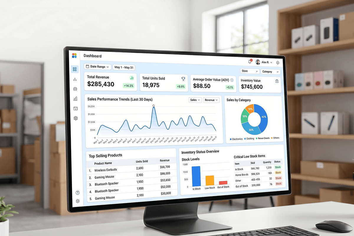
Ready to track retail sales, inventory, and product performance in one Power BI dashboard?
Project Overview
The dashboard was developed for a retail-focused business managing weekly performance across multiple product categories and retailers.
A retail-focused business team needed a centralized dashboard to track weekly sales, inventory, and product contribution across retailers, categories, and product families.
However, performance data was spread across multiple views, which made weekly business reviews slower and less actionable.
As a result, sales leaders and category teams needed a clearer way to identify growth drivers, declining product groups, and upsell opportunities.
To solve this challenge, X-Byte Analytics developed a Power BI retail dashboard that brings sales-out performance, inventory movement, product mix, and unit contribution into one interactive reporting environment.
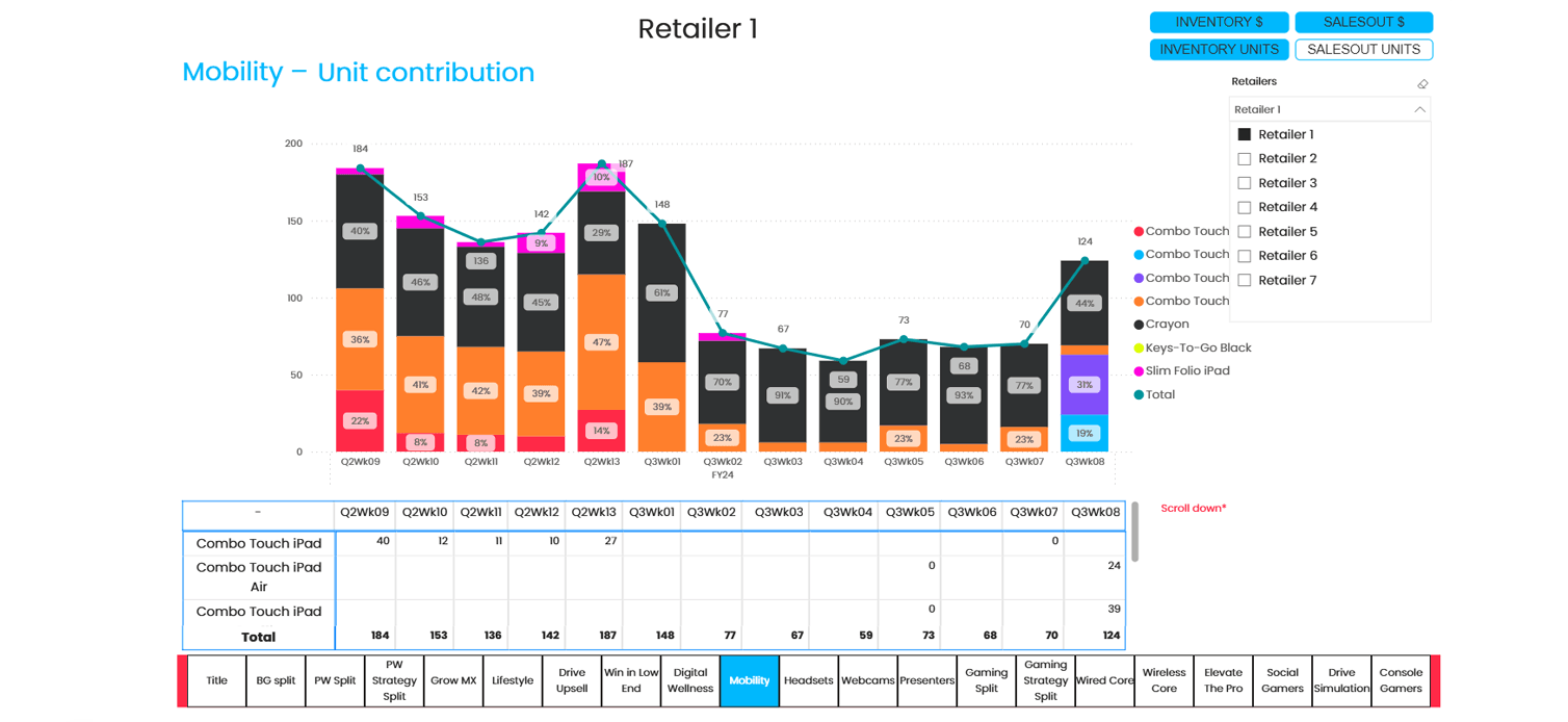
Moreover, the dashboard allows users to switch between Inventory $, SalesOut $, Inventory Units, and SalesOut Units. Therefore, decision-makers can review both revenue-level and unit-level performance from a single dashboard.
The dashboard includes retailer filters, weekly trend visuals, stacked contribution charts, category navigation, and product-level tables.
Consequently, teams can monitor Business Group Split, Personal Workspace contribution, Grow MX performance, and Drive Upsell movement without depending on manual reporting.
Result: The client gained a structured Power BI dashboard for faster weekly reviews, better product contribution tracking, and more confident sales and inventory planning.
Client Business Challenge
The client needed more than a static report. They required a decision-ready retail sales dashboard that could help business teams understand weekly performance quickly.
Previously, category contribution, inventory movement, and sales-out trends were difficult to compare in one place. Therefore, teams were spending more time preparing reports than analyzing business actions.
Key challenges included:
- Limited visibility into weekly product contribution
- Difficulty comparing inventory and sales-out performance
- Manual effort in preparing retailer-wise reports
- No unified view of category, product, and KPI-level trends
- Slow identification of declining product groups
- Limited visibility into premium product growth
- Difficulty validating chart insights with product-level numbers
Because of these challenges, the business needed a Power BI retail sales and inventory dashboard that could support faster reviews, better category planning, and stronger sales decisions.
Key KPIs Tracked
Our dashboard have ability tracks the most important sales, inventory, and contribution KPIs for weekly retail performance reviews. Each KPI was selected to help sales, category, and inventory teams make faster business decisions.
- Inventory $: Tracks inventory value across retailers and product categories.
- SalesOut $: Measures sell-out revenue generated through retail channels.
- SalesOut Units: Tracks units sold to end customers each week.
- Unit Contribution %: Shows each product or category’s contribution to total units.
- Business Group Split: Compares performance across Gaming, PC Keyboards & Combos, Pointing Devices, Tablets, Headsets, and Webcams.
- Personal Workspace Split: Tracks sub-category movement across workspace products.
- Grow MX Performance: Monitors premium MX product contribution and growth.
- Drive Upsell Performance: Evaluates upsell-focused product movement.
- Retailer-Level View: Allows users to analyze performance by selected retailer.
Moreover, each KPI is supported by weekly charts, contribution percentages, trend lines, and detailed tables.
Solution Offered: Power BI Dashboard Development
X-Byte Analytics designed the Power BI retail dashboard with a business-first reporting approach. The objective was not only to visualize data, but also to help teams answer important sales and inventory questions faster. Therefore, the dashboard was structured around KPI switching, retailer filtering, product contribution, and category-level performance tracking.
Data Structuring and KPI Mapping
Weekly retail sales, inventory, product, category, and retailer data were organized into a structured reporting model. In addition, core KPIs such as Inventory $, SalesOut $, Inventory Units, SalesOut Units, and Unit Contribution % were mapped to business review needs.
This ensured that each dashboard page supported a clear reporting objective. As a result, teams could analyze performance using consistent definitions across all views.
Product Category and Retailer Modeling
The model was created around retailers, weeks, business groups, sub-categories, and product families. Therefore, users could move from high-level category analysis to detailed product contribution insights.
Logical views such as Business Group Split, Personal Workspace Split, Grow MX, and Drive Upsell were also included. Consequently, teams could quickly understand where product contribution was improving, declining, or shifting across weeks.
Power BI Dashboard Design
Interactive Power BI visuals were built to show weekly unit trends, product mix movement, and contribution percentage changes. Stacked column charts were combined with total trend lines, which made performance patterns easier to interpret.
Additionally, detailed tables were added below the visuals. Therefore, users could validate exact numbers without exporting data or switching back to spreadsheets.
KPI Toggle and Retailer-Level Filtering
The dashboard includes KPI toggle buttons for Inventory $, SalesOut $, Inventory Units, and SalesOut Units. It also allows users to filter by retailer, which makes performance comparison more focused and practical.
Because of this flexibility, sales teams can review sell-out movement, while inventory teams can track stock levels. Meanwhile, executives can use the same report to monitor weekly performance at a strategic level.

Weekly Business Review Enablement
The dashboard was designed for sales reviews, category planning meetings, product performance discussions, and retailer performance tracking. As a result, teams can move from manual reporting to guided decision-making.
Moreover, the dashboard helps highlight categories that need action. These actions may include inventory balancing, promotion planning, upsell execution, or product-level sales focus.
Key Features of the Dashboard
Dashboard converts weekly retail data into interactive insights for sales, inventory, and category teams.
Together, these features make the dashboard useful for weekly performance meetings. In addition, they help business teams identify trends, contribution shifts, and product-level opportunities faster.
Business Benefits of Retail Sales & Inventory Dashboard
01
Improve Weekly Sales Visibility
Track sales-out, inventory, and product contribution in one centralized dashboard.
02
Identify Product Contribution Shifts
Understand which product groups are driving or declining week by week.
Strengthen Inventory Planning
Compare inventory units and sales-out movement to improve stock decisions.
04
Support Upsell Strategy
05
Enable Faster Retail Reviews
Give leadership, category teams, and sales teams one view of performance.
Who Gains Actionable Insights from This Dashboard?
Each team can use the dashboard for a different purpose. For example, sales leaders can track weekly performance, while inventory teams can monitor stock movement. Similarly, leadership can review contribution trends and identify categories that need strategic attention.
Technology Stack
The dashboard was developed using a Power BI-focused business intelligence stack. This stack supports interactive reporting, KPI calculations, and scalable dashboard publishing.
Power BI
Power Query
Dax
Structured Sales and Inventory Data

Power BI Service
Results Achieved
The Power BI retail analytics dashboard gave the client a centralized view of weekly sales, inventory, and product contribution performance. It helped business users review multiple KPIs, compare category movement, and identify product-level trends without depending on scattered reports.
Key Results:
1 Unified Dashboard
4 KPI Views Enabled
Multiple category views created
7 Retailer Options Supported
Weekly review readiness improved
Product-level tables added
As a result, the organization gained a more reliable way to monitor weekly product performance. Moreover, teams could identify category shifts, premium product opportunities, and upsell gaps with greater confidence.
When Should Your Business Build a Similar Dashboard?
Your business should consider a similar Power BI retail sales and inventory dashboard if your teams still depend on manual spreadsheets for weekly sales reviews. In addition, this dashboard is valuable when multiple teams use the same sales, inventory, and product performance data.
You should build this type of dashboard if:
- Your sales and inventory reports are still prepared manually
- Your team struggles to track weekly product contribution
- You need retailer-wise sales-out and inventory visibility
- Your category managers need faster performance insights
- Your leadership team wants one view of retail KPIs
- Your upsell and premium product strategies are difficult to measure
- Your current reports do not support quick decision-making
A custom dashboard becomes especially valuable when sales, category, inventory, and leadership teams need one version of truth.
Build a Retail Power BI Dashboard Around Your KPIs
Need visibility into sales-out, inventory units, retailer performance, or product contribution?
We helps retail and ecommerce businesses build custom Power BI dashboards for weekly reporting, inventory tracking, category performance analysis, and executive decision-making.
Talk to our Power BI experts and build a dashboard tailored to your retail KPIs.