Patient Management Analytics Dashboard for Healthcare Organizations
- Home
- Case-Study
- Patient Management Analytics Dashboard for Healthcare Organizations
Project category
Patient Management Dashboard for Healthcare Organizations
Healthcare
Germany
4.5 Months
Looking to gain clearer insight into patient visits, costs, and growth patterns?

Project Overview
A growing healthcare organization in Germany needed a clearer way to understand how patients were moving through its services. While patient data existed across registration systems, clinical records, and billing platforms, it wasn’t easy to answer basic operational questions quickly, such as which departments were experiencing higher demand, which doctors were seeing the most patients, or how visit volumes were changing month over month.
Demographic trends and diagnosis patterns were especially hard to assess without manual analysis. Financial visibility was also limited, as treatment costs and payment status had to be reviewed separately, delaying revenue insights. As patient volumes increased, leadership needed a more structured, reliable way to monitor activity, demand, and costs without relying on static reports.
To solve this, we designed a Patient Management Analytics Dashboard using Power BI that brought patient visits, clinical data, and financial metrics into a single analytical layer. The dashboard allowed teams to explore trends interactively, monitor growth patterns, and understand how patients, diagnoses, and costs were connected.
Result: Healthcare decision-makers gained immediate clarity into patient flow, service demand, and financial performance, enabling faster planning and better coordination across teams.
Key KPIs Tracked
The Power BI Healthcare Dashboard tracks critical patient, clinical, and financial metrics to support data-driven operational and strategic decision-making across healthcare organizations.
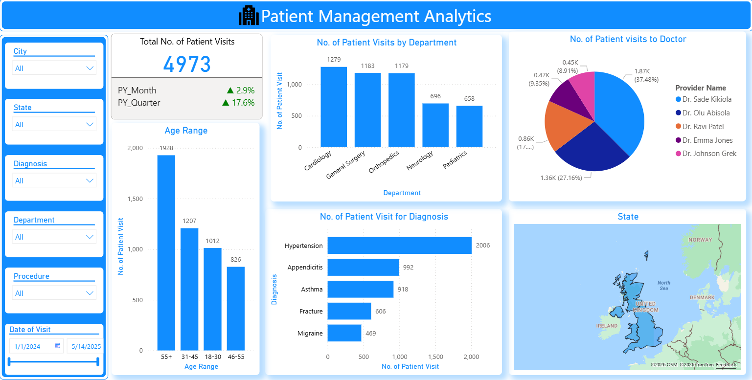
- Total Number of Patient Visits - Captures overall patient activity within the selected timeframe to measure service utilization.
- Patient Visits Growth - Highlights changes in patient volumes compared to the same periods last year, helping assess growth patterns.
- Patient Visits by Department - Shows which departments receive the highest and lowest patient traffic, enabling resource optimization.
- Patient Visits by Doctor - Provides doctor-wise patient distribution to support workload balancing and performance monitoring.
- Patient Distribution by Age Range - Breaks down visits by age group to uncover demographic trends and evolving care needs.
- Patient Visits by Diagnosis - Identifies the most frequent medical conditions driving patient visits and clinical demand.
- Treatment Cost by Diagnosis - Links diagnoses with total treatment costs to highlight major cost contributors.
- Cost by Payment Status - Separates collected revenue from outstanding payments for better financial visibility.
- Monthly Patient Visit Trends - Visualizes patient volume fluctuations over time to support forecasting and capacity planning.
Each KPI is presented through interactive visuals that automatically update as new data is added, ensuring timely and accurate insights for healthcare leaders.
Solution Delivered - Patient Management Analytics with Power BI
The dashboard was built using a phased analytics approach to ensure accuracy, scalability, and usability across clinical and administrative teams.
Data Consolidation & Structuring
- Patient visits, diagnosis records, cost data, and payment information were combined into a unified data model.
- Data inconsistencies were resolved to ensure accurate comparisons across time periods and departments.

Growth, Trend & Pattern Analysis
- Historical data was examined to surface trends in visit volume, seasonal behavior, and demographic changes.
- Comparative views were created to evaluate monthly, quarterly, and year-over-year performance.

Analytics-Driven Dashboard Design
- Separate views were designed for leadership, operations, and clinical stakeholders.
- Visuals focused on clarity—making it easy to move from high-level summaries to detailed breakdowns.

Automated Updates & Financial Signals
The dashboard refreshes on a scheduled basis to reflect the latest patient and billing data.
Key indicators draw attention to changes in visit growth, rising treatment costs, and unpaid balances.

Shared Access & Decision Support
- Teams across administration, finance, and clinical operations can work from the same dashboard.
- Insights are easily shared during reviews, planning sessions, and performance discussions.

Core Features of the Dashboard
The dashboard converts raw healthcare data analytics into concise, actionable insights, delivering clear visibility into patient volumes, workloads, demographics, costs, and growth trends through interactive, shareable reports.
Why Hospitals Need Patient Management Dashboard?
The Patient Management Dashboard enables healthcare organizations to plan capacity better, optimize clinical resource utilization, gain stronger financial visibility, make faster data-driven decisions, and reduce manual reporting through automated, real-time analytics.
01
Better Capacity Planning
Understanding visit patterns helps anticipate demand and allocate resources effectively.
02
Improved Clinical Resource Utilization
Doctor and department-level insights support fair workload distribution.
Stronger Financial Awareness
Linking diagnoses with costs and payment status improves revenue visibility.
04
Faster, Informed Decisions
Leadership no longer waits on manual reports to understand patient activity.
05
Reduced Reporting Overhead
Automated analytics eliminate repetitive spreadsheet-based reporting.
Who Gains Actionable Insights from This Dashboard?
Technology Stack
The dashboard is built using Power BI for interactive reporting and analytics, Azure Analytics Services for centralized data processing, and SQL with Python for automated data transformation and workflow efficiency.
Power BI

Azure Analytics Services

SQL & Python
Results Achieved
After implementing the dashboard, the organization achieved unified visibility into patient activity, faster insights into demand and revenue, and improved confidence in data-driven operational and financial planning.
Key Results:
The organization moved from fragmented reporting to a structured analytics-driven approach for managing patient operations.